


M O R A L I S A P S Y C H O E D U C A T I O N A L S E R V I C E S

Moralisa Psychoeducational Services is an organization that specializes in providing culturally sensitive, unbiased, and bilingual psychoeducational, academic, and counseling services. The organization strives to assist and provide services to students with unique educational needs. While working with MPS, I redesigned the brand’s logo, business card, Instagram account and created a style guide and website. Keep scrolling to learn more about the work I’ve completed for MPS!


R E B R A N D
Refreshing the Look and Feel of MPS


MPS sought further to develop its current advertising tactics and media channels. After conducting a brand analysis, I identified key weaknesses and opportunities for growth and ultimately recognized the need for a rebrand. Over three months, I worked to better translate the brand’s image across its advertising/media channels and amplify the unique aspects that set MPS apart from other psychoeducational service centers. Following our partnership, the organization has doubled its original follower count, gained more interaction, received many positive reviews, and acquired new clientele. Keep scrolling to learn more about the rebrand!
For an overview of the rebranding process, check out the creative brief below!


B R A N D I N G
Logo Redesign & Brand Style Guide Creation

The new style guide remains true to MPS's academic and youthful nature in a more aesthetically pleasing and eye-catching way. The new branding utilizes primary colors in more inviting shades and introduces gradients alongside solid colors to add more dimension to the organization’s content. It also incorporates thinner and more playful typefaces to add visual intrigue to the branding and uses emoji-styled icons to bring more modernity and simplicity to the brand.

The new logo design provides a more vibrant, fun, and modern twist on the old logo by utilizing a brighter color palette and emoji-styled graphic icons. The brighter shades bring a more lively look to the brand. The apple aligns with the psychoeducational/academic focus of the brand, the globe highlights the brand’s unique, culturally sensitive, and bilingual nature, and the star amplifies the brand’s dedication to providing children with the services they need to be star students.
The new style guide remains true to MPS's academic and youthful nature in a more aesthetically pleasing and eye-catching way. The new branding utilizes primary colors in more inviting shades and introduces gradients alongside solid colors to add more dimension to the organization’s content. It also incorporates thinner and more playful typefaces to add visual intrigue to the branding and uses emoji-styled icons to bring more modernity and simplicity to the brand.


The brand’s original logo was distorted and felt a bit outdated, so I wanted to breathe new life into the brand with a more vibrant and modern logo design. The redesign establishes a clearer, more consistent, and recognizable look for the brand that better translates what they do, who their clientele is, and what makes them unique in a more aesthetically pleasing way. I also created a style guide to ensure that the rest organization’s branding remains cohesive across all future advertising materials and media channels. To compare the original branding to the new one, look below! Look through the gallery above for more information about the logo redesign and brand style guide!
Applications Used: Adobe Illustrator


B E F O R E
H O V E R T O R E D E S I G N
A F T E R
B U S I N E S S C A R D S
Redesigned to Match New Branding

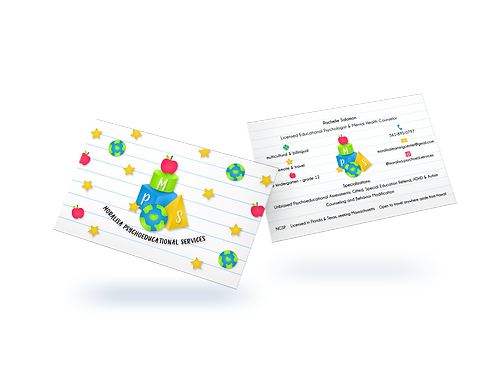
Alongside a logo update, the organization also needed a new business card. Although the original design featured the old logo, it did not uphold a cohesive, consistent, aesthetically pleasing visual brand look. Given this, I redesigned the card to match the organization’s new branding and provided two variations upon the client’s request. To compare the original card to the new one, look below! Look through the gallery above for more information about the business card redesign!
Applications Used: Adobe Illustrator

MPS wanted to update the services they provided on their business card, so I made those edits and redesigned the card to match the new branding. The original design lacked personality and visual intrigue, so I added color to the new design and reformatted them so that the information was presented in a more organized and visually appealing way. I provided two design variations upon the client’s request. Tap through the gallery to learn more about each variation!

The cover design for both variations features the brand’s logo alongside graphic icons. The icons for the first variation are puzzle pieces which are commonly used to raise awareness of autism which is one of the brand’s biggest passions. Tap through for a closer look at the cover!

MPS wanted to update the services they provided on their business card, so I made those edits and redesigned the card to match the new branding. The original design lacked personality and visual intrigue, so I added color to the new design and reformatted them so that the information was presented in a more organized and visually appealing way. I provided two design variations upon the client’s request. Tap through the gallery to learn more about each variation!
B E F O R E
A F T E R

S O C I A L M E D I A
Updated to Match the New Branding & Relaunched
R E L A U N C H
Instagram Story & Feed Posts
After updating the aesthetics of the organization’s social media account, I gave the brand a proper relaunch with new content. Before the rebrand, the organization’s original posts lacked cohesion and did not successfully inspire people to interact with the account. Given this, I created aesthetically pleasing and on-brand infographics that shared key information about the brand’s mission, services, contact information, and relevant yet shareable content that encouraged people to interact with the posts and the brand overall. For a closer look at the infographics, look through the galleries below! Look through the gallery and video above for more information about the posts and account layout!
Applications Used: Adobe Illustrator & Instagram


B E F O R E
H O V E R T O R E V I S E
A F T E R


After spicing up the account’s aesthetics, I created three new posts to properly relaunch the brand and share relevant content to inspire people to interact.

I created the “About” highlight to share information about the brand’s mission and purpose.

To add more diverse content on the page I recommended posting shareable infographics about different topics surrounding mental health and psychoeducation. As mentioned above autism awareness is a big passion of the brand so the third feed post I created for the account shared information about autism awareness. At the end of the post I also made sure to include a reminder informing followers about MPS’s services prompting them to reach out if they need the organization’s help.
After spicing up the account’s aesthetics, I created three new posts to properly relaunch the brand and share relevant content to inspire people to interact.
A E S T H E T I C S
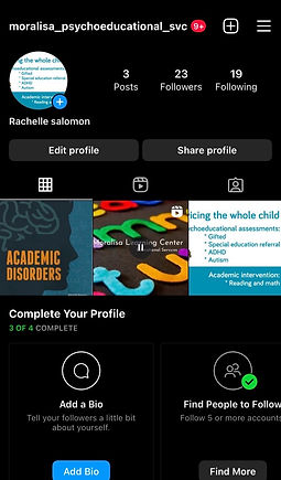
New Profile Picture, Bio, Highlights & Highlight Covers
After updating the organization’s logo, branding, and business card, the next step was to tackle its social media account. The brand’s original Instagram account was very underdeveloped and did not successfully utilize all of the platform’s features to the fullest. Given this, I made various updates to solve this issue and, of course, ensured that the look of the account matched the new branding. To compare the original account to the new one, look below! Look through the gallery above for more information about the social media updates!
Applications Used: Adobe Illustrator & Instagram

I updated the account’s profile picture to the brand’s new logo. Tap through the gallery for a look at this graphic as the pfp!

I wanted to add more personality and highlight the brand’s unique aspects and services in its IG bio, so I made the following changes. I converted the account to a business account, changed the name, and added a category, pronouns, contact info, and a link to the brand’s new website. I also incorporated emojis matching the icons in the new logo to add fun and visual intrigue to the bio.

For a closer look at the layout and bio, tap the link to visit the brand’s Instagram account!
I updated the account’s profile picture to the brand’s new logo. Tap through the gallery for a look at this graphic as the pfp!


W E B S I T E

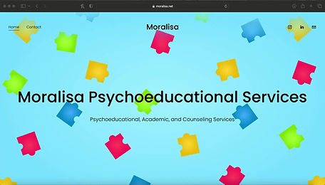
To wrap up this rebranding project, MPS needed a website to fully maximize the benefits of its media channels and reach more people. Before our partnership, the organization did not have a website, so I created a two-page site encompassing information about the brand, its services, reviews, contact info, and links to the brand’s social accounts. I made sure to include the URL on the Instagram page to draw more traffic to the site and allow followers to gain more information not presented on the account. I designed the website to remain consistent with the new fun and vibrant branding on the account, but I also wanted to maintain an air of professionalism and maturity that would appeal to parents, school personnel, and service providers. The new website will allow the brand to look more trustworthy and official and prompt visitors to reach out and ultimately work with MPS. For a closer look at the website, check out the video above or tap the URL!
Applications Used: Squarespace & Adobe Illustrator
