

G R A P H I C D E S I G N
The following projects explore graphic design through merchandise, product packaging, social media, branding, poster, and app design, etc.


D E S I G N H E R O S C R E E N S
Typography, Storytelling, & Gif Design
Anifa Mvuemba is the founder of the clothing brand, Hanifa and a revolutionary in the fashion industry. She is most famously known for her digital fashion show which featured invisible 3D figures modeling her designs down a runway. As a designer she pays great attention to detail, shares and explores her identity through her work and actively works to promote greater positivity, inclusivity, and innovation in the fashion industry. As a black woman myself, a big lover of fashion and an advocate for positivity, diversity and inclusivity in the industry, Mvuemba serves as a big role model and design hero to me. Deeply inspired by her story I created a gif and 5 page document of ipad screens discussing her life and work. In this project I explored typography and storytelling through digital and gif animation design. Open the gallery for more details on this project!
Applications Used: Adobe Illustrator, InDesign, Photoshop

The inspiration for my splash page was the digital runway show Anifa put on for her Pink Congo Line. She made runway history by having 3D ghostlike, invisible figures model designs from her line down the runway.

For the following pages I used a cursive typeface similar to her brand logo. I also used the color pink to align with her popular Pink Congo clothing line as well as her overall branding for Hanifa. I also utilized a pink gradient to add more fun visual design elements to the project. The titles on each page connect across to form a line starting and ending with Anifa's name on this first page. This symbolizes Anifa’s firm belief in creating and following her own path.

The inspiration for my splash page was the digital runway show Anifa put on for her Pink Congo Line. She made runway history by having 3D ghostlike, invisible figures model designs from her line down the runway.

S U S T A I N A B L E F A S H I O N I S T A S
Branding, Logo, & Social Media Design


For the account’s profile picture I wanted to keep a more simplistic look depicting a leaf with curved lines inside for more visual intrigue. I used a trendy font and the colors lime green and hot pink for an vibrant and edgier look.

“Sustainable Fashionistas” is a brand and instagram account that serves as a platform for education, resources, and connection for all individuals interested in being eco-conscious and sustainable fashionistas. The brand/account is designed to serve as a tool to combat fast fashion. In this project I explored the fashion and consumer industry in relation to the environment and presented a solution to help improve their interactions through social media. Open the gallery for more details on this project!
Applications Used: Adobe Illustrator, Instagram

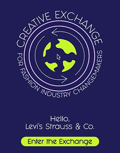
C R E A T I V E E X C H A N G E
Logo, & App Design
“Creative Exchange” is an app designed to help fashion industry businesses and brands connect and facilitate collaborations with culturally diverse designers and experts. The app is designed to serve as a tool to combat cultural appropriation in fashion. In this project I explored identity, fashion and presented a potential solution to a social issue through app design. Open the gallery for more details on this project!
Applications Used: Adobe Illustrator, XD

The main logo for the app includes arrows surrounding a lime green globe. This all works together to symbolize the app's greater purpose of allowing businesses and brands to connect with diverse designers and creators to exchange ideas and spread knowledge about their respective cultures on bigger platforms across the world.

The app facilitates collaborations and creative exchanges through its filter search feature, meeting set ups, and other project management tools such as task notifications and a calendar with important deadlines/dates, etc.

The main logo for the app includes arrows surrounding a lime green globe. This all works together to symbolize the app's greater purpose of allowing businesses and brands to connect with diverse designers and creators to exchange ideas and spread knowledge about their respective cultures on bigger platforms across the world.
F E M ` P I R E
Branding, Logo, Merchandise, & Product Packaging Design


For the revised t-shirt design I wanted to present the concept through auras and promote the idea that all women have their own unique and beautiful and powerful magical auras they should feel confident and proud to own. Given this direction I worked with a gradient and stars to align with the whimsical nature of this new direction. The design also reflects a boob which further aligns with the idea that this brand is designed for women.

Scroll through the gallery for more information on this redesign!

With ever purchase of the t-shirt, branded water bottles would be also be provided inside the packaging as a free gift. Women could carry them around with them throughout their daily lives and again this would allow the brand to garner more awareness and reach alongside the t-shirt, stickers, and tote bag.
For the revised t-shirt design I wanted to present the concept through auras and promote the idea that all women have their own unique and beautiful and powerful magical auras they should feel confident and proud to own. Given this direction I worked with a gradient and stars to align with the whimsical nature of this new direction. The design also reflects a boob which further aligns with the idea that this brand is designed for women.
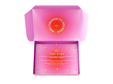


“Fem-pire” is a community made for and by fearless females dedicated towards empowering all women to unapologetically own their unique auras and inner power. This brand is a reimagination of a past project of mine in which I created a concept for a brand and designed a t-shirt and product packaging that worked to encourage women to be prideful and secure in themselves regardless of societal standards or ideals. "Fem-pire", formally known as “Femme Power” executes the same brand mission and purpose in a new, refreshing and more refined way. In this project I explored typography, logo, merchandise, and product packaging design through the rebranding of my past designs. Open the gallery for more details on this project!
Applications Used: Adobe Illustrator, Photoshop
S P R I N G F I E L D C I T Y R E B R A N D
Branding, Logo, Outdoor, & Print Ad Design


For my redesign I worked with two mountains to represent the two mountain ranges in the Ozarks. The placement of this heart at the tip of the mountains symbolizes the city’s name as the “heart of the Ozarks“. I incorporated a road leading towards the heart to symbolize the famous “Route 66“ which runs through the heart of the city. The heart also serves to represent Springfield’s positive and community centered nature overall.

Springfield, Missouri, often referred to as “the heart of the ozarks” is a vibrant city loved for its small town charm, beautiful landscapes, and fun/historical attractions. Contrary to its charms it is often listed as one of the worst/most dangerous cities to live in the U.S. Given this I rebranded Springfield’s logo to better highlight and translate its true beauty above this tainted image. In this project I explored branding through outdoor, print, and logo design. Open the gallery for more details on this project!
Applications Used: Adobe Illustrator, XD


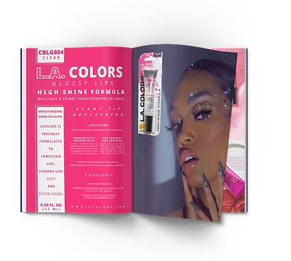
L A C O L O R S P A C K A G I N G R E D E S I G N
Typography, Marketing, & Print Design

For the first poster we were required to utilize all of the copy on the original product packaging and we were only allowed to use two colors. I used a sans serif font for a more modern and edgier feel and I also made sure to keep the same/similar typographic hierarchy on the packaging. I also used design elements such as squares and a hot pink color to reflect packaging elements. Overall I wanted the poster to be aesthetically pleasing and fun to the brand’s intended audience.

The first poster I created was designed to appeal to the product's current audience. Based on the product packaging and the brand research I conducted I noted that the product’s audience was on the younger side. They are people who can’t afford to buy expensive makeup products. They love to experiment with colorful, vibrant and fun makeup looks.

For the first poster we were required to utilize all of the copy on the original product packaging and we were only allowed to use two colors. I used a sans serif font for a more modern and edgier feel and I also made sure to keep the same/similar typographic hierarchy on the packaging. I also used design elements such as squares and a hot pink color to reflect packaging elements. Overall I wanted the poster to be aesthetically pleasing and fun to the brand’s intended audience.
LA Colors is a vibrant and bold makeup brand marketed towards beauty fanatics. I redesigned the packaging for the brand’s staple clear lip gloss into two posters marketed towards different audiences. The first appeals to the brand’s current target market which are more youthful and adventurous makeup users. The second appeals to a new audience I defined as older, more sophisticated and simplistic makeup users. In this project I explored typography and marketing through print design. Open the gallery for more details on this project!
Applications Used: InDesign

T I P S Y T H R I F T S
Branding, Merchandise, & Logo Design


Tipsy Thrifts is an outdoor night market/thrift shop and social hotspot for Gainesville college students to indulge themselves in trendy fashion, amazing music and food, refreshments (both alcoholic and non alcoholic), and most importantly good vibes! In this project I explore typography and logo design through the creation of a local brand/business of my choosing. Open the gallery for more details on this project!
Applications Used: Adobe Illustrator